

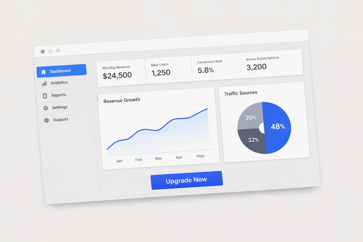
Designing a website to promote an application (mobile app, SaaS platform, or digital product) is not just about aesthetics—it’s a structured process that blends UX architecture, behavioral psychology, and conversion optimization.
A high-performing application promotion website must:
- Clearly communicate value within seconds
- Build trust in a skeptical digital environment
- Guide users toward a defined action (download, signup, demo)
- Perform flawlessly across devices and network conditions
In this niche, design decisions directly impact acquisition cost, activation rate, and ultimately product growth.
Executive Summary — What Drives Conversion in Application Promotion Websites
Application promotion websites exist to convert interest into action—downloads, signups, or demos. Unlike generic websites, they must communicate product value instantly while minimizing friction.
Key Takeaways
- Clarity beats creativity: Users decide within ~3–5 seconds whether your app is relevant
- Above-the-fold is critical: Zero-click behavior demands immediate value communication
- Trust is fragile: Users are skeptical of apps due to privacy concerns and saturation
- Speed = revenue: Slow sites significantly reduce install and signup rates
- CTA hierarchy matters: Too many choices dilute conversion focus
Summary Table
| Design Element | Priority Level | Conversion Impact |
| Value Proposition Clarity | Critical | High |
| CTA Visibility | Critical | High |
| Page Speed | High | High |
| Trust Signals | High | Medium–High |
| Mobile Optimization | Critical | High |
| Visual Design | Medium | Medium |
Understanding How Application Users Behave Online
Users visiting an app promotion site are typically evaluating whether the app solves a specific problem. Their behavior is fast, skeptical, and comparison-driven.
Behavioral Characteristics
- Rapid scanning rather than deep reading
- High sensitivity to unclear messaging
- Strong reliance on social proof and ratings
- Frequent switching between competitor sites
- Mobile-first browsing behavior (60–80% traffic typical)
User Journey Stages
- Awareness (ad, search, referral)
- Evaluation (features, benefits, reviews)
- Validation (trust signals, testimonials)
- Conversion (download, signup)
- Post-click (app store or onboarding)
High vs Low Intent Behavior
| Behavior Type | High-Intent Users | Low-Intent Users |
| Time on Page | Longer | Short |
| Scroll Depth | Deep | Minimal |
| CTA Interaction | Frequent | Rare |
| Comparison Behavior | Focused | Broad |
| Trust Sensitivity | Moderate | High |
Information Architecture — Structuring for Clarity and Conversion
A clear structure reduces cognitive load and helps users quickly understand your app.
Recommended Site Structure
- Homepage (value + CTA)
- Features / Product Page
- Use Cases / Solutions
- Pricing (if applicable)
- Testimonials / Case Studies
- About / Company
- Help / FAQ
Navigation Principles
- Keep top navigation under 6 items
- Use action-oriented labels (e.g., “Get Started”)
- Sticky navigation improves accessibility
Content Prioritization (Above the Fold)
- Headline (what the app does)
- Subheadline (who it’s for)
- Primary CTA
- Visual (product screenshot or animation)
Flat vs Deep Navigation
| Model | Pros | Cons |
| Flat | Faster access | Can feel cluttered |
| Deep | Organized | Slower navigation |
Best Practice: Hybrid—flat top-level, deeper subpages.
Homepage Design Strategy for Application Websites
The homepage is the most critical conversion surface.
Must-Have Elements
- Clear headline (problem + solution)
- Supporting subheadline
- Primary CTA (Download / Try Free)
- Product visuals or demo
- Trust indicators (ratings, users, logos)
- Feature highlights
- Secondary CTA
Section Breakdown
| Section | Purpose | Conversion Role |
| Hero | First impression | Drives initial engagement |
| Features | Explain value | Builds understanding |
| Social Proof | Build trust | Reduces hesitation |
| CTA Section | Push action | Converts users |
Above vs Below the Fold
- Above: clarity + action
- Below: validation + details
Conversion Architecture — CTA Design, Forms, and Funnel Flow
Conversion is not a single click—it’s a structured funnel.
CTA Design Principles
- One primary CTA per page
- High contrast buttons
- Action-oriented copy (“Start Free Trial” > “Submit”)
CTA Table
| CTA Type | Placement | Copy Style | Impact |
| Primary | Hero | Action-driven | High |
| Secondary | Mid-page | Informational | Medium |
| Exit Intent | Popups | Incentive-based | Medium |
Form Optimization Steps
- Minimize fields (only essentials)
- Use inline validation
- Offer social login options
- Show progress indicators (multi-step forms)
- Add reassurance (privacy note)
Funnel Mapping
- Homepage → Features → CTA → Signup → Onboarding
Trust Signal Architecture for Application Websites
Trust is a decisive factor due to privacy concerns and app fatigue.
Key Trust Signals
- User testimonials
- App store ratings
- Security badges
- Client logos
- Case studies
Trust Signal Table
| Trust Signal | Placement | Impact |
| Reviews | Near CTA | High |
| Certifications | Footer | Medium |
| Testimonials | Mid-page | High |
| User Stats | Hero | High |
Implementation Notes
- Use real photos and names
- Avoid generic testimonials
- Highlight quantifiable results
Mobile UX Design Considerations
Mobile is the primary interaction channel for app promotion.
Mobile Design Checklist
- Thumb-friendly CTA placement
- Large tap targets (min 44px)
- Simplified navigation (hamburger or bottom nav)
- Fast-loading visuals
- Minimal text blocks
Desktop vs Mobile Priorities
| Factor | Desktop | Mobile |
| Navigation | Expanded | Collapsed |
| Content Density | High | Low |
| CTA Placement | Multiple | Focused |
| Speed Sensitivity | Medium | High |
Page Speed and Technical Performance
Performance directly impacts conversion rates.
Core Web Vitals Targets
| Metric | Benchmark | Impact |
| LCP | < 2.5s | High |
| INP | < 200ms | High |
| CLS | < 0.1 | Medium |
Quick Wins
- Compress images (WebP/AVIF)
- Lazy load below-the-fold content
- Minimize JavaScript
- Use CDN and fast hosting
- Limit third-party scripts
SEO and Content Structure Supporting Conversion
SEO brings users, UX converts them.
SEO-UX Alignment Checklist
- Clear H1 with value proposition
- Structured headings (H2–H3)
- Keyword alignment with intent
- Internal linking for depth
- Fast-loading pages
Content Formats
| Content Type | Role | Conversion Impact |
| Landing Pages | Acquisition | High |
| Blog Content | Awareness | Medium |
| Case Studies | Trust | High |
| FAQs | Objection handling | High |
Accessibility and Inclusive Design
Accessibility is both ethical and a conversion advantage.
Accessibility Checklist
- WCAG 2.2 compliance
- High color contrast
- Keyboard navigation
- Alt text for images
- Clear typography
Accessibility Table
| Element | Standard | Risk if Ignored |
| Contrast | 4.5:1 | Low readability |
| Navigation | Keyboard-friendly | User exclusion |
| Media | Alt text | SEO + UX loss |
Analytics, Heatmaps, and Continuous Optimization
Design is never finished—data drives improvement.
Key Metrics
- Conversion rate
- Bounce rate
- Scroll depth
- CTA click rate
- Funnel drop-off
Tools Table
| Tool | Use Case | Insight |
| Analytics | Traffic & conversion | Quantitative |
| Heatmaps | User behavior | Visual |
| Session Recording | UX issues | Qualitative |
CRO Testing Process
- Identify problem (data)
- Form hypothesis
- A/B test variation
- Analyze results
- Implement winner
Common Design Mistakes That Kill Conversions
Critical Errors
- अस्पष्ट value proposition
- Too many CTAs
- Slow load times
- Weak mobile experience
- Lack of trust signals
Mistake vs Solution
| Mistake | Solution |
| Generic messaging | Clear value proposition |
| Long forms | Simplify fields |
| Hidden CTA | Prominent placement |
Comparative Analysis — Application Websites vs Adjacent Industries
| Factor | App Promotion | SaaS | E-Commerce |
| Primary Goal | Downloads | Signups | Purchases |
| Trust Signals | Reviews, ratings | Case studies | Reviews |
| CTA Type | Install / Try | Demo | Buy |
| Content Depth | Medium | High | Product-focused |
Transferable Insights
- SaaS: onboarding clarity
- E-commerce: urgency tactics
- Both: trust and speed importance
Implementation Roadmap
Step-by-Step Plan
- Define conversion goals (downloads, signups)
- Map user journeys
- Audit existing UX (if redesign)
- Build sitemap
- Create wireframes
- Design UI
- Develop site
- Optimize performance
- QA testing
- Launch
- Measure baseline
- Iterate continuously
Appendix — Metrics, Benchmarks, and Tools
Benchmarks
| Metric | Typical Range |
| Conversion Rate | 2–8% |
| Bounce Rate | 40–60% |
| Session Duration | 1–3 min |
Recommended Tools
- Design: Figma, Adobe XD
- Analytics: GA4, Mixpanel
- CRO: Hotjar, Crazy Egg
- Accessibility: WAVE, Axe
Frequently Asked Questions About Application Website Design
1. What is the most important element on an app promotion website?
The value proposition in the hero section—users must instantly understand what the app does.
2. How many CTAs should a page have?
One primary CTA, supported by secondary options if needed.
3. Should I prioritize mobile over desktop?
Yes—most traffic comes from mobile, especially for app promotion.
4. How do I increase trust quickly?
Use real testimonials, ratings, and recognizable brand logos.
5. How fast should my website load?
Ideally under 2.5 seconds for optimal conversion performance.
6. Do animations help conversion?
Only when they clarify functionality—avoid decorative animations that slow performance.
7. How often should I redesign my site?
Continuously optimize rather than redesign—use data-driven iterations.
8. What role does SEO play?
SEO drives traffic, but UX determines whether that traffic converts.